The Poet and the Means of Production
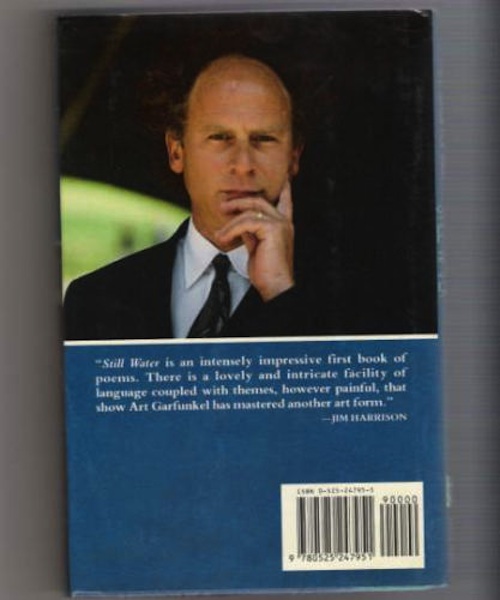
For a brief period, around 1992, I brewed beer, which in retrospect amazes me, because I’m not a handy fella, nor do I like to cook, and but for the fact the end product was 5 gallons of delicious intoxicant, I wouldn’t today believe I undertook so labor-intensive a project. I mention this because it occasioned my first encounter with Photoshop. Back then I didn’t have a computer, but my friend, singer-songwriter and Stereorrific Records co-founder Jeff Mellin, was starting a graphic design firm and offered to make a label for the bottles. We named the beer, a stout, after Art Garfunkel’s 1989 book of poems, Still Water (Dutton), which Jeff had recently snagged at Buck-a-Book. Like George Bush, Sr., before a grocery checkout scanner, I sat there literally agape as Jeff extracted a pensive Garfunkel from the author photo and dropped him on a beach in front of a bikini-clad model scanned from a Spiegels catalog. There wasn’t enough beach to fill the proportions of the label, so Jeff made more beach with a few mouse-clicks. That really blew my mind.
About 5 years later, I was with Brian Lucas at Jeff Clark’s old apartment in SF’s Mission District. Through his magazine/press Angle, Brian was going to publish my first chapbook, The Dream of Curtains (1998), and Jeff had agreed to do the design and layout. Though we’d just met, I already had an inkling of what Jeff was capable of from the first issue of his own magazine, Faucheuse, but actually seeing him manipulate text in QuarkXpress was another revelation. Looking at a font menu with Jeff is like being a kid in a toy store, and all told, I found Quark even more exciting than Photoshop. And, at this point, I had a computer, so the process seemed much less forbidding than making the beer labels had. I needed to do this! Somehow I got my hands on a copy of Quark, and Jeff gave me a couple of tutorials on the basics. After buying a paper-cutter and heavy-duty stapler, and inheriting Jeff’s old laser printer, I was in business. For reasons I don’t recall, I named my operation “Kolourmeim Press,” after the Replacements song, “Color Me Impressed.” A stupid, off-hand name, but it stuck.
For roughly a decade, Kolourmeim was a press without ambition, with editions ranging anywhere from 5 to 100, handed out exclusively to friends and acquaintances. But times and programs change, computers die, and I no longer have the set up to make books like I used to. And even if I did, I wouldn’t have time, as all of my publishing energies now go into City Lights. I’m not bemoaning this good fortune, but at the same time, I do miss making books by hand. For this week’s post, therefore, I decided to interview two Bay Area poets who make their own books: Jason Morris, author of From the Golden West Notebook (Publication Studio, 2011), who edits PUSH Press and the magazine Big Bell, and Erin Morrill, author of Pornologue (Berkeley Neo-Baroque, 2011), who runs Trafficker Press.
How did you get into editing and publishing?
Jason Morris: I think I can answer the first question best by trying to describe what an impression other small magazines made on me a few years ago. When I first got a copy of Bill Berkson’s magazine from the ’70s, Big Sky, I was floored by the contrast between form and content: I got a copy of Big Sky #4, and inside were poems by Robert Creeley, Clark Coolidge, Bernadette Mayer. The cover is a great Philip Guston drawing. & the production values of the magazine, just stapled, with not too much art (all of it, however, carefully chosen, well paired & amazing) & hardly any color, impressed me a lot. Just the idea that if you edited carefully enough you could put out a very high quality magazine for not very much money. That you could do it yourself.
Erin Morrill: When I was a kid I would always start these hand-illustrated children’s books, but I never really finished them. I think I was thirteen when I made my first book, a lot of glued images and collage work and favorite poems, and I gave it to this girl I really liked. My first experiences with editing and publishing was as poetry editor for Wolverine Farm Publishing’s Matter Journal, a grassroots, eco-minded lit mag based out of Fort Collins, Colorado. In 2002, Todd Simmons, founder of WFP, was looking for people to work on the magazine. I was an undergrad at Colorado State at the time and a mutual friend recommended me to him. We took the mag to a perfect bound format and built up distribution. I really admired Todd’s willingness to develop a whole new skill set (his background was in eco-science/land management) and to put himself into considerable debt in order to realize his vision. In 2005, I moved to Oakland, California and began working with Kelsey Street Press in Berkeley. Kelsey Street was founded by Patricia Dienstfrey and Rena Rosenwasser amongst others in 1974, but those two have really seen it through, which isn’t nothing. It’s the longest running women’s press in the country. I was really into their meticulousness and collaborative spirit of production. The education I got from working with these two presses was invaluable.
Tell us a little about your press: who is involved and when did you begin publishing? Tell us what your press’s first and most recent titles are.
JM: As far as the press, I do two things that I consider separate. There’s Big Bell, a magazine that comes out sporadically (I just finished the fifth issue) and then also there’s PUSH, which is chapbooks. Big Bell I have been doing entirely on my own, although now I’m happy to say that for this most recent issue and from here on out, I’ll be splitting the work with two other friends: Russell Dillon, who’s a poet here in SF, and J Grabowski, who is a Brooklyn-based visual artist.
J Grabowski & I started PUSH together, about 5 years ago, when we printed up copies of a book that we’d collaborated on. That was called American Outpost, and it was my words and his drawings. Doing that showed me that the thing was doable. And not only that, it taught me that if you did it, then it would come to have a real life of its own in the world. I mean 100 copies of a stapled book of drawings and poems is a small hill of beans but it is a hill of beans nonetheless. And I liked that they were handmade and had little or no online life. So the first PUSH book was a collaboration between J Grabowski and me. & then after that we did The Way We’re Used To by Evan Rehill, then Easy Eden, which is a collaboration between Micah Ballard and Patrick Dunagan. And then several more, including some that J has secretly made in Brooklyn, or has made unbeknownst to me (telepathic editorial collaboration), and most recently we put out Kevin Killian’s Selected Amazon Reviews Volume Two. I should also mention that I do probably about 90% of the production stuff for both Big Bell and PUSH at my house.
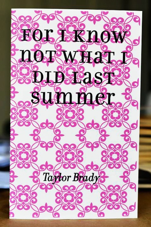
EM: The origin story of Trafficker Press isn’t exactly a straight line. Initially Bhanu Kapil and I proposed doing a chapbook series through Kelsey Street Press, in early 2007. Our desire was to counter a certain homogeny we felt permeated publishing, as in not enough non-whites and queers were being published, but we didn’t necessarily want to publish all women. So our proposal wasn’t the best fit for them. Bhanu eventually realized that her prolific life obligations possibly weren’t conducive to running a chapbook press. My friend, Andrew Kenower, had already expressed interest in getting into design work so he suggested that he and I start a press together. Over the years Lara Durback, though not a press member, has been our absolute angel in her assistance with letterpressing covers and book sewing. She taught Andrew and me how to pamphlet stitch our first chapbook, Blank Missives by Esther Lee, and has been there every step of the way. Bhanu stayed on initially, conducting interviews with each of our writers which appear at the end of our chapbooks. We’ve evolved the model due to increased output of chapbooks so that now each interview is conducted by the writer of the preceding chapbook. This has the effect of putting the writers in dialog with one another and of expanding a sense of community. Our most recent chapbook, Taylor Brady’s For I Know Not What I Did Last Summer, just got released at our press reading at The Harvey Milk Center last week.
You both have presses with their own design aesthetic; what are your typical means of production for your titles or does the process change from title to title?
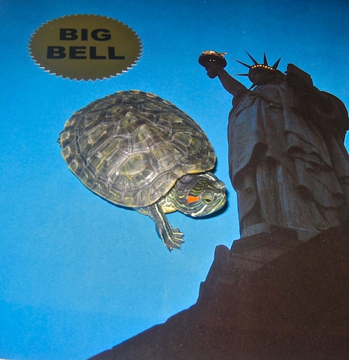
JM: I have typical means and values of production for Big Bell, at least one of which was arrived at by chance. I started the first issue & realized I was not going to have the money to do the kind of cover I wanted. So I wound up buying cheap coffee table books at a thrift store, cut down the pages to 8.5” x 11,” put “BIG BELL” stickers on each one & then stapled them onto the magazines as covers. So each one is different, which winds up looking good when they’re in a stack. When I see a copy somewhere, the cover is familiar but surprising to me. Aside from that, I try to use high quality paper when I can afford to and I like to stick to a particular font. My basic attitude is if I try and make the magazines and books look as professional as possible, they’ll still look a little grimy. If I’m publishing a book like Cedar Sigo’s Slivers, which is a sort of collection of B-Sides, or as Cedar & I discussed it, like a leaked mixtape, I want it to be stapled, I want to use construction paper for the flyleaf, and so forth. Easy Eden, which was a collaboration between Patrick Dunagan and Micah Ballard, has the feel of an ongoing conversation. The content of the book dictated that its form stay simple, personal, and subterranean. I liked that I never knew whose poems were whose. You let certain jokes stay private, and that extends by default to the book’s form. In-house, meaning resourceful & relevant to the urges of the writing.
EM: Our process has evolved since we initially started making books together. Our first two chapbooks we paid to have made which was costly and prohibitive of us continuing. The guts we always get printed at a Krishna Copy in Berkeley, mainly because of poetic precedent—that’s where David Larsen got a lot of his printing done and that’s where Hooke Presse gets their chaps printed as well.
Our division of labor is fairly established now in that Andrew does our design work and manages the website and I letterpress all of our covers, usually through the use of photopolymer plates. Sometimes I’ll choose the cover image, but Andrew executes all of the design. I mean, we compromise at times, we don’t always agree, and then there’s working with the limitations of the letterpress in terms of text size and image density, but Kenower is a top notch designer. Then I do most of the folding and sewing of the chapbooks, a lot of loving with the hands, sometimes friends help. I’ve always considered myself a chapbook doula; “Books Not Babies” is a tee shirt I’ve long wanted to make.
Tell us a bit about your editorial aims: what type of poet or poetry do you seek to publish? Do you take inspiration from any particular presses, past or present?
JM: Apart from Big Sky, there are a lot of other small press magazines from the ’60s and ’70s I draw inspiration from: Duncan McNaughton’s Mother magazine, Reindeer, edited by Carter Ratcliff, Out There, Kenward Elmslie’s Z, Chicago, which was edited by Alice Notley, Wieners’ Measure, Angel Hair, etc. etc. One thing I try really hard to do is to let the magazine present a wide variety of different kinds of poetry, different kinds of writing. As long as it’s good at what it’s doing, I don’t let myself care whether it’s necessarily my taste. It shouldn’t always be, although I always want it to be the magazine’s taste, same as a poem. The idea being to get the thing out of my control & beginning to signal its own concerns. So there emphatically isn’t a type of poem I try and get for Big Bell, aside from a good poem. As far as PUSH goes, there’s more need for collaboration between me & the poet, for a chapbook. So I’ve really just put out chapbooks of people here in the Bay Area, & really just people I know & know what it’s like to work alongside. I may hope to broaden that net, at least geographically.
EM: My and Bhanu’s original aims of covering some gaps we saw, or better, blurring the distinctions, has persisted. Trafficker publishes a lot of work by queer writers. In fact, Ariel Goldberg has joked that it’s the only inadvertently queer press in the country. Historically, I’ve taken a lot of inspiration from the diy methodology of zine culture, particularly the riot grrrl zines of the ’90s, but I don’t think that translates aesthetically, just as an approach to making. As for being inspired by other presses, I really admire Ugly Duckling and Factory Hollow, but those are obvious choices. Andrew and I were invited to the CUNY Chapbook Conference in March. It was amazing to see the proliferation of styles of publication in this moment when chapbook production seems to be particularly flourishing given certain paradigm shifts in the publishing world, access to technology and such. I’m really into Greying Ghost’s chapbooks and their repurposing of ephemera. I worry that our press makes things too perfect. Sometimes I wish for not a less laborious, but a messier aesthetic. I just checked out Least Weasel’s Glossomatics, Thus, by Brenda Iijima; it kinda knocked my socks off. Locally speaking, Berkeley Neo-Baroque’s chapbooks, Taxt Press, Hooke Press, No No Press have been important variant approaches to me.
What are your future plans for the press? Where or how can we get your publications?
JM: Big Bell is transforming into something that will show more editorial collaboration. Which I’m thrilled about, not only because I can use the help of new eyes & friends to split the workload, but also because I’m hoping we can put out more copies. That’s an ongoing project. More chapbooks are going to be coming out on PUSH, though I can’t say with any certainty when that will be. I’m hoping to put out two more books of collaborations, hopefully right at the same time. I can never be entirely sure what Grabowski is up to, over there in New York. But ideally, we will put out two short chapbooks of collaborations between poets, similar to Easy Eden, sometime late this year or early next. Copies of Kevin Killian’s book, Selected Amazon Reviews, Volume Two, are available here. However, I am mainly sold out of the other PUSH chapbooks. You can find copies of Big Bell at David Highsmith’s Books & Bookshelves, here in San Francisco, which is a great shop full of excellent poetry books & well-built bookshelves. They also often have poetry readings there.
EM: Our future plans for the press is to make as many chapbooks by amazing writers as we can. We decided to take a year off in 2010 because of some hard circumstances in our lives, but will likely put out at least five titles this year, having now completed four of those. Our next one will be Lauren Shufran’s Inter Arma. It feels really good to be making books again and it seems like they’re starting to find homes with people which is wonderful, because you don’t want that which you shepherd into the world to be orphaned. The press is starting to almost recoup production costs which means we can continue. Currently, our chapbooks are available online.
Garrett Caples is the author of Lovers of Today (2021), Power Ballads (2016), Retrievals (2014), Quintessence...
Read Full Biography


