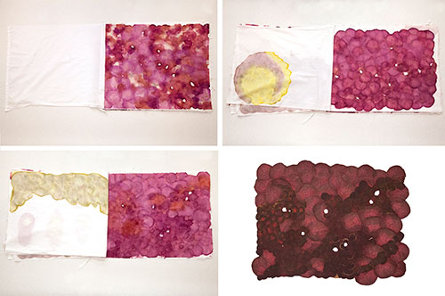
Poetry Cover Arts: Volume 205
[Note: This begins a semiannual series in which we highlight Poetry’s recent cover artists. These posts are a collaborative effort with Art Director Fred Sasaki and the artists themselves. For other recent posts on Poetry’s covers, see here and here.]
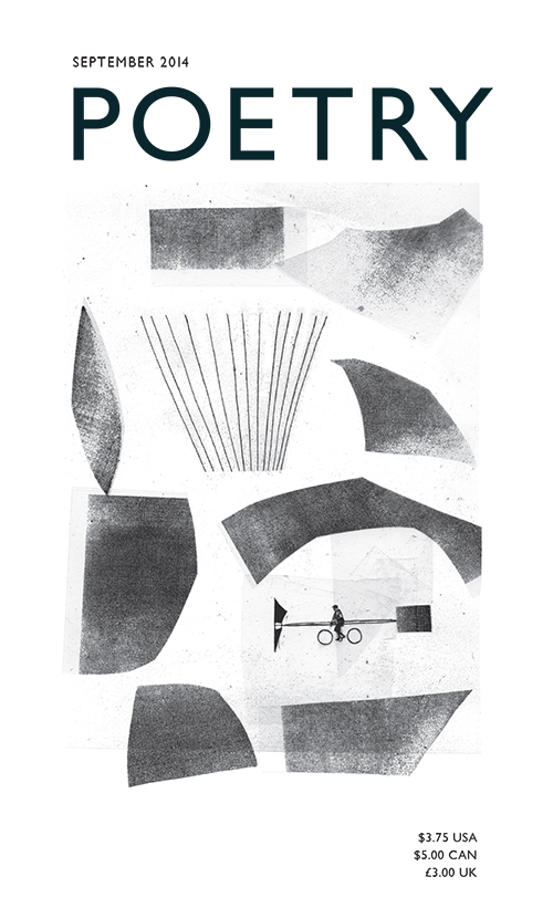
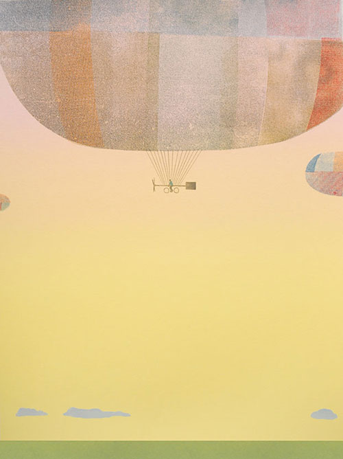
September 2014: Sonnenzimmer, “Cromwell Dixon’s Elements of Flight,” 2010
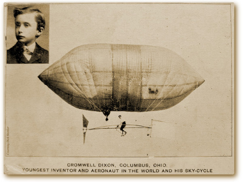
In the summer of 1907, fifteen-year-old Cromwell Dixon took flight in his “Dixon Sky Cycle” before an astonished crowd, flying at a height of 200 feet for over an hour. The airship consisted of a coal-gas-filled, varnished balloon with a wooden undercarriage. A bicycle powered a propeller at the front and the sky cycle was steered by a rudder connected to the handlebars. This cover for Poetry’s September 2014 issue was designed by Sonnenzimmer (Nick Butcher and Nadine Nakanishi) as a screen print and later adapted for the magazine. They say, “We were perplexed how such a fantastic achievement of pre-war aviation got lost. If-you-can-dream-it-you-can-do-it-kind-of-visuals were on our mind then.”
Here is the original print:
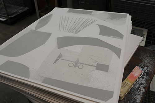
Sonnenzimmer also made another print, this time of the cover, for Freedom of Shadow: A Tribute to Terry Adkins. Here’s a process shot for that:
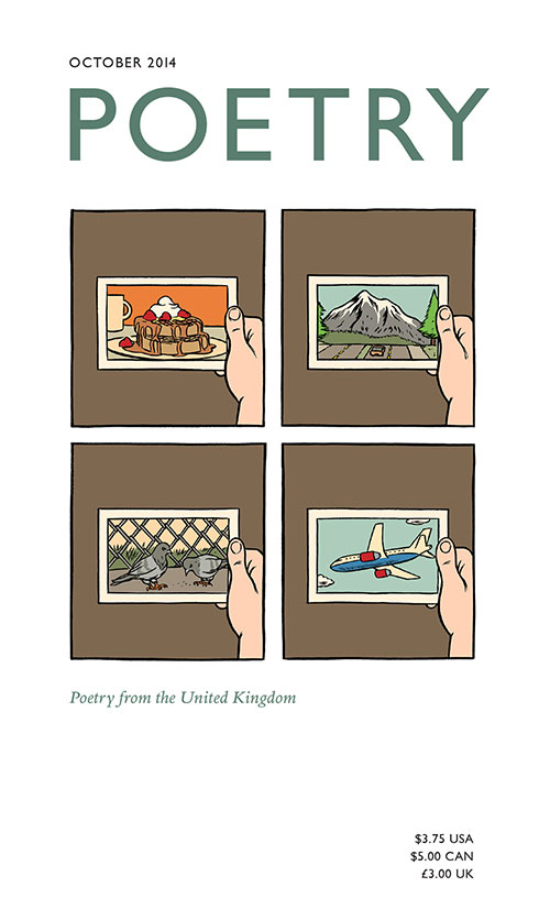
October 2014: Paul Hornschemeier, “Postcards from Moritz the Cat,” 2011
This cover is from Paul Hornschemeier’s Life with Mr. Dangerous (Villard/Random House). Here’s a preview of the book and interview with Hornschemeier about the work. For more, see here.
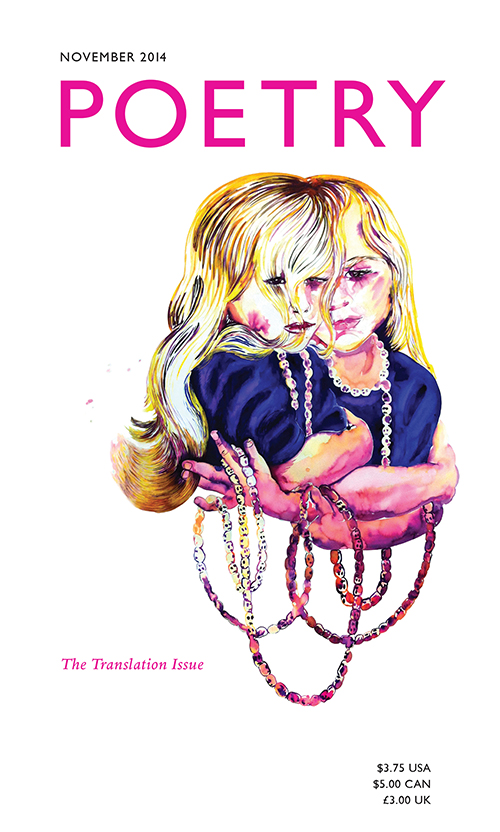
November 2014: Lise Haller Baggesen, “Entanglement Practice,” 2011
We asked Lise Haller Baggesen about her haunting work for the November cover:
Entanglement Practice is a double portrait of my daughter, holding a single strand of Buddhist mala beads with the double function of memento mori and curlicue adornment. I like the idea of twins conjoined by the hair as each other’s shadow or doppelganger. Their hair and beads are entangled and conjoined like life and death—hence the title.
In my body of work this image relates to previous work in which pattern recognition and portraiture are aligned, such as the series Electric Motherland from 2005.
In recent years, my practice has evolved from a traditional painting practice toward a hybrid practice including curating, writing, and installation work—but watercoloring remains a go-to material. I am currently using it to develop (new) ideas for my upcoming solo show at Threewalls in April 2016.
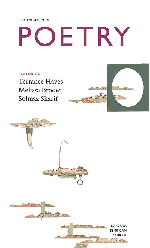
December 2014: Kirsten Stolle, “Animal Pharm,” 2014
Stolle’s series Animal Pharm investigates the controversial practice of “pharming”: “the process of genetically modifying plants and animals so that they produce substances that may be used as pharmaceuticals.” She says:
In 2009, the FDA approved the first drug produced in the milk of genetically engineered goats. The blood protein Antithrombin was extracted from the goat’s milk and used to create anti-clotting drugs. These transgenic goats, specifically engineered to create pharmaceuticals within their bodies, live on controlled university and biotech farms. Since 2009, cattle, sheep, chicken, rabbits, and pigs have been genetically modified to produce proteins and drugs.
Playing off Orwell, her collages critique the role of corporate and government influence on our lives. See more of her work here.
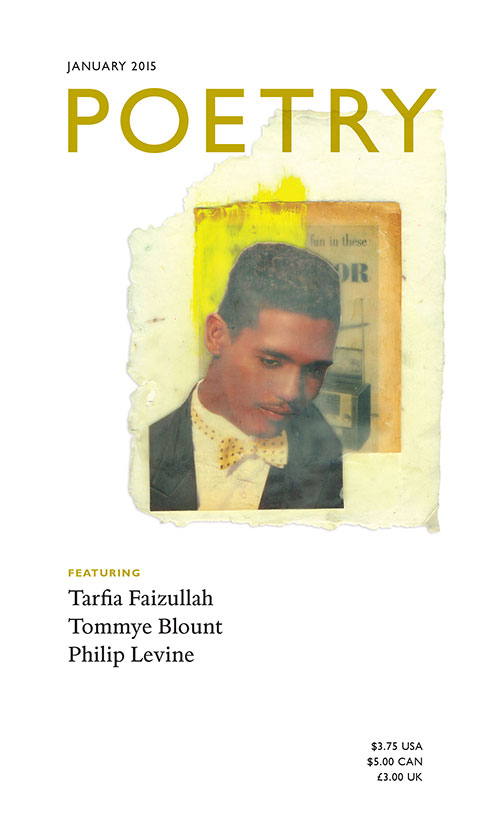
January 2015: Krista Franklin, “Encaustic Dandy,” 2011
Krista Franklin is both a poet and visual artist. Her first appearance in the magazine was on the cover of the January 2015 issue with Encaustic Dandy; her first poem in the magazine leads off the April 2015 issue. She is also one of the lead artists who created The Chicago 77, a collaborative poem comprised of found language and objects gathered from the 77 community areas of Chicago, where she lives. We asked her to say a few words about her work for the January cover:
Encaustic Dandy was a part of a series of works I created while enrolled in an encaustics course taught by Jenny Learner at Lillstreet Art Center in 2011. I took the course as a way to supplement or expand on what I was learning about handmade paper at the Center for Book and Paper Arts at Columbia College Chicago, and to also challenge myself around what I had been doing with collage for years prior. There are still so many things I love about the encaustic process: the smell of the beeswax, the almost-instant "cooling" of the beeswax when applied to whatever surface, and of course the ghostly images I'm able to create through that medium. Encaustic Dandy is an encaustic collage on a rather (technically) unsuccessful and unfortunate sheet of handmade paper that I pulled, which accounts for its unique shape. I still love how the collage feels both vintage and contemporary. Here's to the Return of the Dandy.
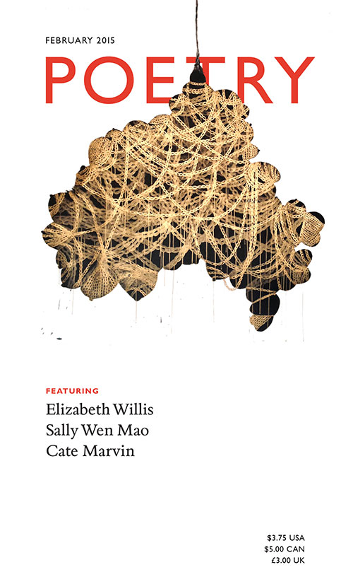
February 2015: Shoshanna Weinberger, “Ménage à Trois,” 2012
Shoshanna Weinberger is from Kingston, Jamaica and works in Newark, New Jersey. She has recently shown her work at Chicago’s Sector 2337 as well as other galleries around the world. Weinberger was awarded a Joan Mitchell Foundation Painters & Sculptors Grant in 2014. We asked her for a statement about the work and she returned:
The cultural history of female exposé, presentation, and excessive notions of beauty drives my work. As an artist, I find the idea of what popular culture defines as feminine beauty to be skewed and distorted.
My practice is an ongoing investigation of experience, memory, abstraction, present and future histories. The work speaks to my persona as woman of mixed race background as a Caribbean-American. The awkwardness of growing-up in a society obsessed with attaining beauty is expressed in malformed images and decapitated bodies. These figures with multiple body parts connected to desire create confusion, humor and tension. The figures have a sex appeal but decidedly are mutations.
In the drawing Ménage à Trois, I employ silhouette to remove all detail to produce anonymity to my subject. Drawing gold chains add dimension over the darkened form. A sense of tension is created by the suspended mass, its heavy and bulky form hung by a single braid of hair. My subject is overtly exotic as well as decidedly and graphically deformed yet visually resembles hanging fruit. The drawing examines the concept of a hybrid, coexisting in human and animal form, of one both grotesque and sexualized.
The drawing signifies the objectification of obsessed and sexualized body parts within our past and current culture. Bound, captured, hogtied and gagged from social freedoms and hanging by a single braid of hair, the braid also becomes politically charged as a symbol of the civil rights movement. Additionally, the suspended form can also be seen a reminder of the hatred in recent American history which led to lynching. Human collection and ownership with specific colonial and contemporary references are examined. These captured bodies relate to the acquisition of wealth, racial injustice, and the display of costly objects as a show of power.
You can read an interview with her here.
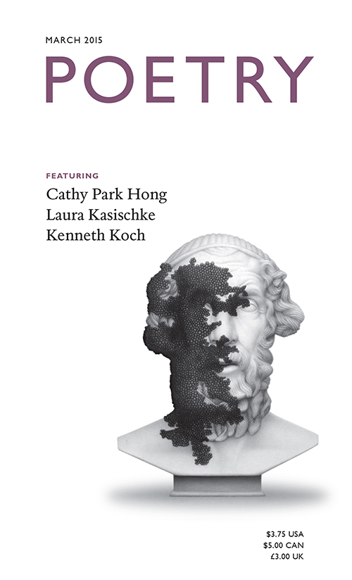
March 2015: “Homer,” Lui Shtini, 2011
You may not notice at first glance, but the cover of our March 2013 issue is actually a pencil drawing. Shtini says:
Homer is part of the series The Matter of an Uncertain Future, a project comprised of five drawings of busts of figures iconic to the development of Western culture: Homer, Socrates, Augustus, Aristotle, and Nero that are being overtaken by a mysterious dark matter. The drawings address our idealization of the past and the anxiety for what is not easily understood and it’s as amorphous, and persistent as the future itself.
You can see more of Shtini’s work here.
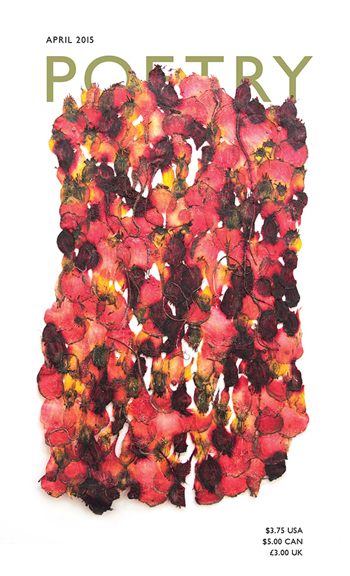
April 2015: Julia Goodman, “Gnoman I,” 2014
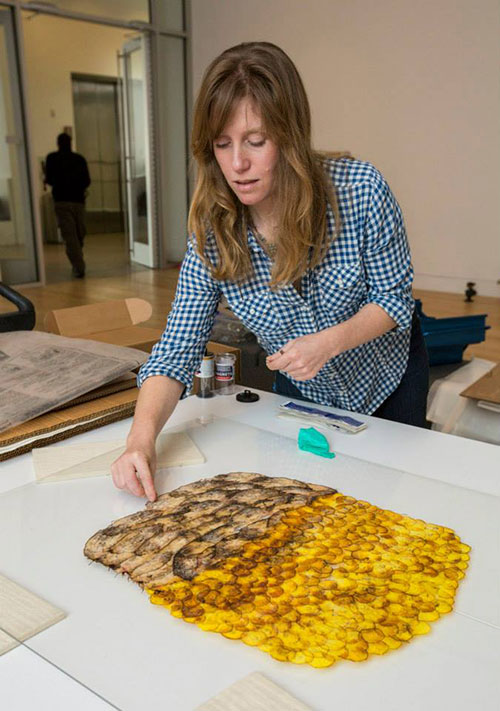
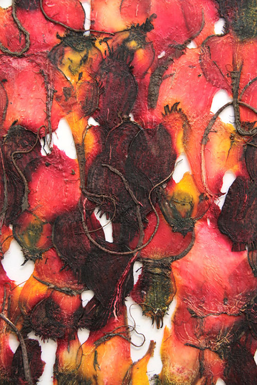
Julia Goodman’s “Gnoman I,” on the cover of our “BreakBeat Poets” issue, is handmade beet papyrus from her series The Root of Scarcity, which is included in the DePaul Art Museum group exhibition Rooted in Soil, on view through April 26, 2015. She says, “I work with delicate and organic materials because they confirm that life is short and we are not in control.” Goodman recounted the root and lifecycle of her work for us in beautiful detail:
At a young age, I witnessed vitality in the face of mortality through my Father’s twenty-year struggle with cancer. Keeping his memory and this lesson close, I work with materials that are simultaneously strong and fragile, echoing corporeal reality. In 2010, I began making papyrus from beets. I found simple satisfaction in letting light come through something that grows underground—through combining materials and processes to invoke a vertical glance, connecting us to the sky above and the earth below. Using bold colors and diverse symmetries that exist underground, I create intensely colored skin—like abstractions that are un-manicured and imperfect with veins and hairs. Irregular shapes are caused by the challenges and circumstances of growing underground. The papyrus itself ages; the brightest colors fade over time.
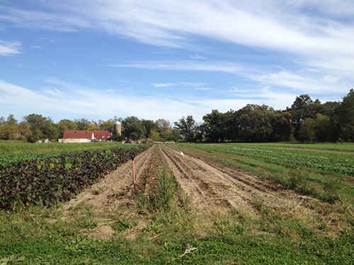
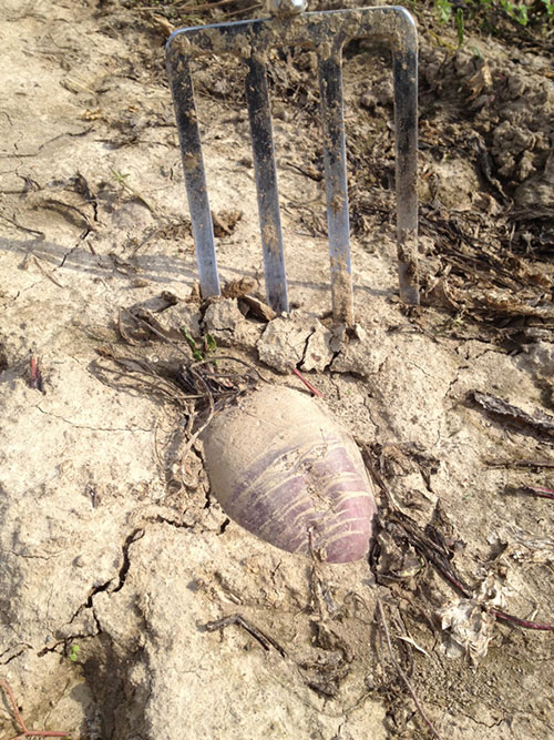
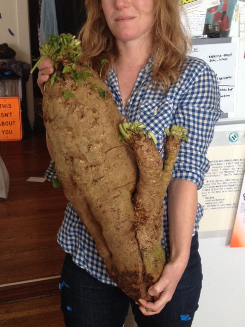
Narrowing my focus within the limitation of one vegetable, my sense of wonder increases as I work with numerous beet varieties of varying colors and shapes. Initially I worked with the most common red beets crosscut revealing red concentric circles. Through researching heritage varieties and shopping for beets at Bay Area farmers markets, a wider range of beets varying in color, shape and size were available. Additionally, I started cutting the beets in different directions to expose more vein-like structures. Since then I partnered with farmers, Peter Jacobsen (Jacobsen Orchards, Yountville, CA) and John Peterson (Angelic Organics, Caledonia, IL). Jacobsen grows extraordinarily large beets for me, and Peterson allows me to glean beets at the biodynamic CSA farm. Using beets gleaned from this coming summer’s harvest, I plan to create an ephemeral site-specific installation of beet papyrus at Angelic Organics based on the connection between biodynamic farming and the zodiac. With plant matter and related stains, I create a visceral connection between the terrestrial and celestial within the continuum between progressive agriculture and pre-industrial farming that rely on working in synch with the cosmos, the soil and the plants.
Here are a few progress shots as well as a detail from her work for the April cover.
