'my visual poems are not really about handwriting': An Interview w/ Paul Ebenkamp, Part I
BY John Sakkis

Hey Paul,
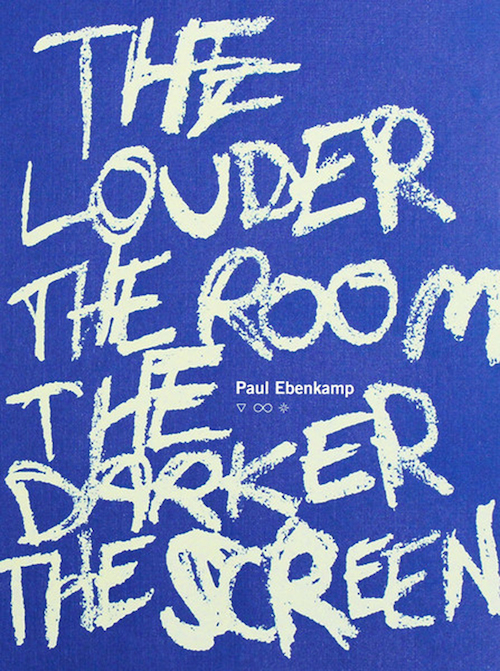
Your book The Louder The Room The Darker The Screen (Timeless, Infinite Light) is my book of the year thus far, I want to ask you about the marker poems, I also do marker poems, I used to write graffiti back in the day, I was horrible at it, I want to say "nice hand styles," and you do, have really nice hand styles, did you ever tag? what kind of marker(s) did you use for these poems? I use Sharpie fat tips in black, red, and blue for mine.
Paul Ebenkamp:
wow, thanks john -- really glad you're enjoying it! i didn't know you did similar work, so yes by all means i'd love to talk about that kind of writing work, and see some of yours --
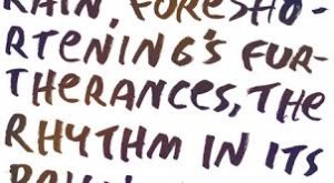
let's see, i used a ton of different materials actually -- for some, it's a combination of chalk pastels on rough construction paper; for a lot of others, it's either highlighter or permanent marker on regular copy paper. and i also use oil pastels, which i think are my favorite utensils apart from the trusty fat-/angle-tipped black sharpie. then at some point i'd start jamming copier settings and xeroxing things crazily, scanning, fucking with them in photoshop and with transparency paper, dust, etc. etc. ...
regrettably, i've never tagged but ever since seeing "style wars" years ago, i've been jealous as hell of taggers, and that (plus seeing an absolutely devastating Cy Twombly triptych in zurich called "Goethe in Paris" and a few Christopher Wool paintings) is probably what got me started on marker poems.
i actually began the longest poem in the book as a sort of side project for the sole purpose of changing my handwriting, because some of my letters had too many strokes and it felt awkward. i just wrote in one book in four alternating highlighters determined to have memorized a new script by the time i was done with the book. so that was an interesting development that i never thought would've resulted in a 50-page poem. (i wonder if perhaps it shouldn't've developed into that.)
John:
I asked about graffiti because your "Os" and your "Es" are amazing, very very black book style,

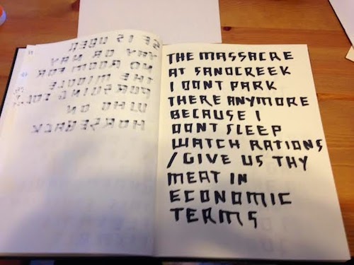
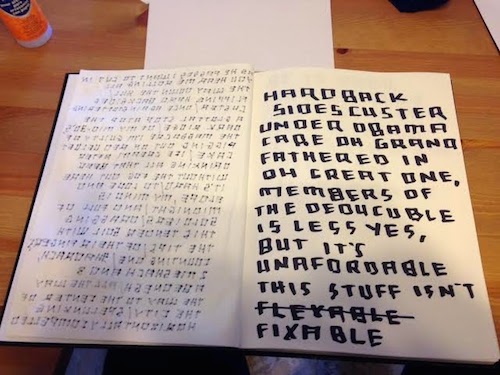
I have a hard time with Es unless I'm doing bubble Es, your vowels look like the scripts that my tagger friends (not "street art," street art needs to die) were really good at. It's funny you mention Style Wars and Cy Twombly, I definitely started doing my marker poems after first being introduced to the "drawn" or "scrawl" poems of Robert Grenier, especially his AFTER NOON SUN SHINE (the first book/ box I bought at SPD after starting my job there in 2008), coupled with the memories of an adolescence surrounded by uber talented graffiti writers (OMS, LORDS, VBC crews); I don't want to say high and low art, but more a syncretism, my interest in poetry and my interest (and inability) in graffiti. I'm rambling, here are a couple examples of my marker poems.


Why were you interested in changing your handwriting? do you typically write poems by hand? I've lost that ability myself, I used to compose in Mead notebooks, impossible now, my handwriting has devolved into literal chicken scratches, brain working faster than my hand, illegible even to me. My block lettered (square lettered) all CAPS marker poems are a way I think for me get back to that Mead composition style, there's a pleasure in it that I miss, and like you, I developed a new handwriting style for myself, my SQUARE CAPS letters as a way to make my writing legible again, it's a necessity as much as it is a style.
Paul:
i need to get that bob grenier book. stephen novotny showed me his work not long ago; I'd never even heard of him, weirdly. i absolutely love it.
sorry for the delay in response, i wrote a ton of garbage and then deleted it.
syncretism, yes. things take all kinds of forms. and you gotta use what presents itself, without necessarily expecting the world from it or maintaining systems of comparison between forms. i've always appreciated visual art at a similar tenor or intensity as with poetry and music, i mean it all kind of blurs together for me, and i'm not all that interested in those formal aristotelian/ruskinian/greenbergian discriminations between them. i mean, as formalities, they're useful arguments for me to rehearse back to myself, but only if my head's really in the game, aware of the interconnectedness of all acts of intention and expression.
the idea being giving one's self permission to do things.
because the advice i've been given is that if you're one of those people who are free to add to the tools you've been given and to create your own and use what you want to use and explore, then you should, because you're one of not all that many humans who can.
but, i want to assert (though aware that closing off potential meaning in this way ultimately does nothing to benefit the work) that my visual poems are not really ABOUT handwriting or paper or chalk or anything; i mean, they are deeply marked by what they're made from, but those materials are in essence a cluster of accidentals that arose just based on how my life was composed at a particular time*. so i just took them and used them, without any idea or plan or hope, but only because i had to keep doing something.
*"particular time" = i got this job at saint mary's five years ago and suddenly had less time to write than before, so i started clearing my desk for 5-15 minutes every day and scrawling something using the tons of markers and highlighters and construction paper stuff that i suddenly had unfettered access to, and then putting it all away and going back to work. i did this with absolutely no plan or intention beyond liking the idea of maybe isolating the good part(s) of my poems and blowing them up to take up more mental and physical space.
and THEN i discovered the scanner and copier in my office, and THEN i discovered the photoshop suite that was on the laptop they gave me when i took the job. so, again, this whole method was based on expediency and need in a given moment, and not about some thesis or point or philosophy i had about doing things this way, though the idea of amping up the little good parts of poems might be considered a "plan."
*
i love the visual/installation art of jenny holzer, joseph beuys, john baldessari, thomas locher, and others who used language spatially in intense and disconcerting and balance-upsetting ways.
and then maybe the freak side of my inspiration being the chapman brothers, black metal vocals and imagery, basquiat, picabia, elsa von freytag-loringhoven, thomas pynchon, mike kelley...
and william blake whose poetry expresses the secret that all of our senses are metaphors for each other.
*
i write by hand a lot, every day for about 30 minutes or an hour, in a notebook. i've been doing this for about five years. they're just regular moleskine 30-lined pages: day books that i steal lines from when i'm writing poems. so i suppose nearly all of my poetry starts with handwriting. i rarely write extemporaneously in verse; i usually have that notebook in front of me.
i had been writing in notebooks daily for about three years when i decided to change my all-caps handwriting. too many strokes, too angular; i wanted a more flowing all-caps script, rounder and thicker. there are actually a lot of visual poems in the book that use my old all-caps style, and i'm glad they're there; basically, the As are sharp teepees, the Hs are three short thick straight lines, the Es are spiky and weird and i could never write E's very well anyway (and was so sick of writing this hated capital E at the beginning of my last name, god that bothered me for like 15 years)...
and at some point, after perfecting the new-style all-caps, i loosened up and invited some of the old-style script back in, depending on the kind of visual space and lettering i was dealing with. it's like everything, i guess: you get obsessed and then that ends. i like having several different somatic hand tactics that i can call up according to their fitness for dealing with whatever hand-eye-coordination situation i find myself in.
*
love the SQUARE CAPS! they could be, size-wise, scaled up enormously, i think -- and there's actually some technical term in graphic designspeak for when a typeface is deliberately hard to read... imma try and find this word
!
John Sakkis is the author of The Islands (Nightboat Books, 2015) and Rude Girl (BlazeVOX Books, 2009...
Read Full Biography

