Shoot, If That Ain’t Too Pretty
CUNY Chapbook Festival
March 31-April 2, 2015
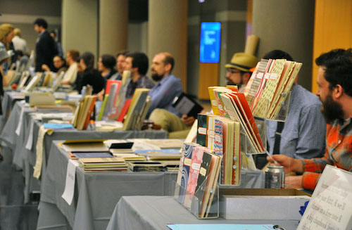
I always try to spend at least a bit of time at the CUNY Chapbook Festival, an annual few-day event staged at the Graduate Center’s main building on Fifth Avenue. It’s snowballed over the last 5-6 years into a real draw, featuring bookmaking workshops, lectures, press spotlights, publisher round-tables, a ton of readings, and its own fellowship award. More and more out of town friends and idols roll in for it too, so there’re rampant sociability pluses. It’s like a stunted AWP, and if AWP needs anything, it’s a proper stunting.
This year I only had a two hour window or so, so I missed out on the majority of events; hopefully one of my blogroll peers at the PF can fill you in better on that. But I never, ever miss the Book Fair if I can help it. The Festival always happens right as the winter thaw is happening, and you know many of these small-press mavericks have been holed up in basements for the last few months cutting, saddle-stitching and screenprinting all sorts of goodies, and this is where I get to see what they’ve been up to. While there were many many reputable presses on hand at the Book Fair that I know and love—Bloof and UDP, Song Cave and Belladonna, Monk Books and New Directions, Brooklyn Arts and Louffa—this year I tried to spend a little more time seeking out some of the idiosyncratic makers. The slightly crazy-eyed folks at barely-decorated tables selling tiny booklets fastened with bolts, accordion-folds, antelope hide, that sort of thing. They don’t have any Jolly Ranchers to hand out, and they’re all about the object-labor behind singular (or very limited edition) works.
Packet Biweekly / Slow Youth Table
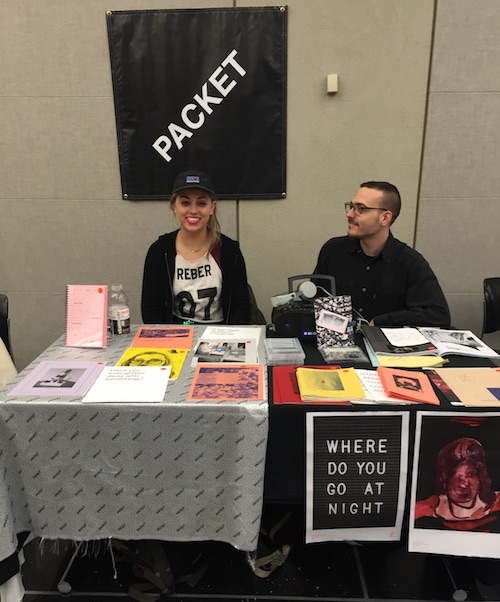
I stopped by when I saw Nicole Reber manning the table alongside her cohort Anthony Cudahy. I first met Nicole a few years back when she was DJ-ing for the monthly Private Line Reading Series down in Gowanus that my friends ran. She’s part of a loose collective behind Packet that’s involved not just in zine-craft but also renegade fashion, radio shows, artist books, the works. Her own efforts are the messes of a charmed life: oddly compelling mixtapes, mixed-media lit-works that use found photos, handwriting and objects; and other material interventions, in addition to helping pump out a new issue of Packet every couple of weeks. Nicole was shilling a new work of hers called Motivation, a booklet of aphoristic sayings, recycled imagery, advice for life and rap analyses, bound up with a companion mix-tape—on cassette—into a jewel-case. Huh.
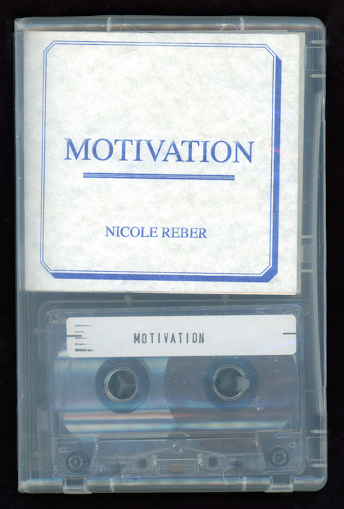
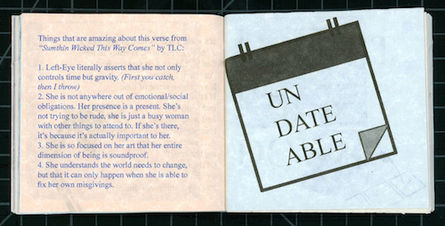
So, Motivation. The project has this real ourobouros quality, kind of consuming itself with references, asides, and auto-contradictions, all under the label of “self-help.” This referentiality kind of reaches an apex when, basically, you top the whole booklet off with, in essence, a remix of itself. I’m interested in hearing how that came about as an object, the two elements gathered together as “package.”
I started working on Motivation right after I had my first solo show last summer. I was trying to build on the obsessive research and collage tactics that I used in that show, and put it in the form of writing. I read a lot of self help books and websites, and it seemed like the more I tried to inform myself, the more overwhelmed I became. I read so much advice that it all started to counteract itself.
At the same time, I had started to think about how artists embed references in the work that they make. How do you tip off a viewer to the other elements in a piece, whether it's dual meanings in the phrasing of a poem or the positioning of images in collage? I had experimented with trying to make hover poems, where links would be embedded in the poems that I was writing, but I don't think that many people clicked through it. I felt like making a mixtape would be a way that I could communicate some of the other non-visual elements that the books called to mind. When I was younger, my mom would listen to these real estate coaching cassettes, and I wanted to bring back the idea of companion audio elements that a lot of self help books had back then. I felt like it would be boring to hear myself talk out the book, so I decided to make the audio portion full of all the music that I listened to to pump me up and get me through my show. I was also watching a lot of inspirational sports documentaries, like the 30 for 30 ESPN stuff, or the Epicly Later'd series on Vice. Artists can be kind of arduous about talking about their process, and I find it kind of hard to look up to other artists from the past because the game has changed so much with the advent of the Internet. Being a good athlete requires a lot of obsession, stamina, and consistency, so I felt like I could maybe learn something more from them, and apply that work ethic to making art. Writing essays about how these videos affected me felt kind of stale, so I felt like I should let the people speak for themselves, by embedding their conversations into the mixtape. Combined, the book and tape function as a spider diagram, each reacting to elements in the other.
I think you should start making some of your own real estate coaching cassettes: you’re onto something there. Specific commentary tracks spliced onto work that is essentially about the all-overness of our current comments-driven society? I don’t know what I just said but I felt it.
That’s pretty funny because I’m about to start taking real estate classes here in the city. I just spent a couple months in California and seeing all that land and friends start to get houses kind of freaked me out. New York is a real suspension of reality when it comes to thinking about your future. I kind of started to realize that even if I were to get married or have a kid, I couldn’t afford to do those things, even if I wanted to. This was the year that I started to notice I wasn’t the youngest kid in the room, and it freaked me out pretty hard, so maybe this is all a response to that. At the same time though, I don’t want to deny myself creativity and feel desperate to build a future when I really don’t know what it holds for me. I could get sick or something, and putting my effort into things that I didn’t even care about wouldn’t have mattered. The nice thing about the real estate thing was that my mom was able to be really around and in control of her schedule when I was a kid, so hopefully it can serve as some sort of personal support while I continue my art practice.
And your cassette practice.
The other thing that gravitated me to audio is that it’s so easy to consume multiple times. Most people can listen to things while they write or move around in a way that reading a book or watching a movie can’t facilitate. I have to multitask my learning or I feel really guilty, which is probably why I can't buy a DVD that comes without commentary. I love knowing how people make things, their reasoning for it, so maybe all of this is an attempt to answer those questions for my viewers. I'll put it in a corner while I'm writing or working on collages. I don't think having an audio companion necessarily encourages a lazy read of the book; I think it's more akin to what you get out of a good interview. You should look to the people you respect to be able to speak about who they like so that you might learn some new artists and be turned on to something that you might not have found out about yourself. My favorite artists are cultural connectors like that, Peter Ivers, Kurt Cobain, the like.
At your booth I was fairly taken with some of your recent “event room sign” works, Mood Boards. Sometimes information frameworks we take to have a certain, rigid role can really zap us when that role is so deliberately re-worked. I mean, when I see these signs I can’t help but think of furtive schedule announcements outside meeting rooms. But these have been made permanent. And even when I stare at your (very not of the conference, shall we say) messages, I can’t help looking at them as though I’m seeking some sort of scheduling or wayfinding answer. It makes for a neat unease.
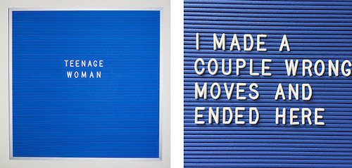
The sign pieces come out of a similar interest in our relationship to language that we have to interact with that isn't coming from our own voices or thoughts. Whether it be captions, ads, tweets, etc, language forces interaction maybe more than any type of art. You can't just look at a word and ignore what its meaning is. If you understand a language, you will compute text on some level. I think that's pretty powerful. I'm trying to avoid using ad language, maybe because I've just seen a lot of sign art playing with the idea of selling text to you. I don't really think you need to sell text. The fact that you can parse meaning by putting different shaped letters next to each other is powerful enough for me.
Fact-Simile Editions Table
I’ve been familiar with Travis and JenMarie Macdonald’s Philly-based Fact-Simile for a number of years because of the extensively excellent eponymous journal and, of course, for their spot-on editions of poet trading cards they’ve been issuing for the last 5-6 years. I’ve got Linh Dinh and Clark Coolidge cards up on my shelves at home, and a bunch more squirreled away somewhere. But I saw much more than that when I stopped by the press’s booth: Fact-Simile had some of the smartest book objects I came across that day, and I felt compelled to rope JenMarie Macdonald, who I’d just then met, into an exchange about just that. I’m glad she suppressed her fight-or-flight responses and told me a bit about Fact-Simile’s new direction.
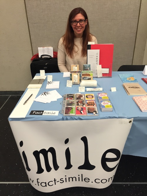
I’m seeing a whole bevy of goodies here that I didn’t expect to see. These newer projects are really emphasizing craft, labor, difference. I guess I associate Fact-Simile with the magazine, and the brilliantly conceived trading cards—the baseball cards. Little did I know. What gives?
While it all started with the magazine in 2008, we’ve been making book objects for nearly as long. That same year, tiny scrolls tucked in reclaimed cigarette boxes became the a Sh Anthology. Soon after, Joseph Cooper’s Points of Intersection became a reclaimed leather reporter-style chapbook, Hoa Nguyen’s Chinaberry became a chenille-wrapped deck of cards designed to resemble a Tarot.
However, making these books and conversing with the authors and readers have taught us a lot, and we’ve recently sharpened the mission of our press. While we still use recycled and reclaimed materials, we are increasingly focused on creating books that embody their content by moving beyond the traditional codex.
In expanding the physical definitions of literature, we strive to bring awareness to the act of reading. The physical form of each of these three books performs an elemental theme of the author’s manuscript and, in the performance, changes the typical 2-dimensional reading experience.
One Hundred Colorado Places
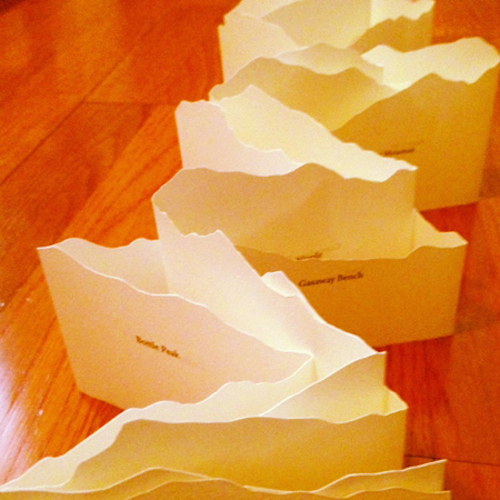
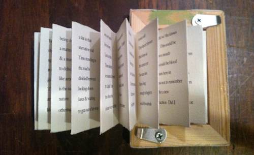
The first time we read Elizabeth Robinson & Erik Anderson’s One Hundred Colorado Places, we experienced the stark awe, bewilderment, isolation and hunger of expedition that characterizes the landscape it depicts: recognizable, to-scale peaks of the Rocky Mountains. Our goal was to manifest these experiences through the form of the book. To evoke a sense of expedition, we started with an accordion-fold style as the base of the book that preserved the site of the individual page set in the continuity of the 30-40 inch long sheet. Carving each individual sheet with mountains and layering them to create a 6-foot long landscape upped the awe factor. Folding the sheets down and binding them into a 4-by-4-inch book set the spring of bewilderment. The challenge of willing such an object into existence comes down to manufacture: how to design a book that can easily be produced in an edition of 100. This particular object takes about 2 hours to make.
One Hundred Colorado Places makes me want to take a tiny lipstick camera and video a “walkthrough” of the extended book from the forced perspective of the valley floor looking up at the words and the peaks. The folds really evoke the depth of the range, even more than the silhouettes of the peaks. While I first got to know Elizabeth many years back in California, I know she’s originally from Colorado, and has been back there teaching for many years. This work really, really reflects Colorado as a place.
We lived in Colorado for a time and drove the mountains regularly, stumbling upon many of the places named in the book. The depth of the range is daunting, humbling, haunting. It’s probably because of this that we love your impulse to adjust your scale to more closely parallel this experience. That’s exactly the type of journey we hope to invoke in the minds of the reader!
Very Different Animals
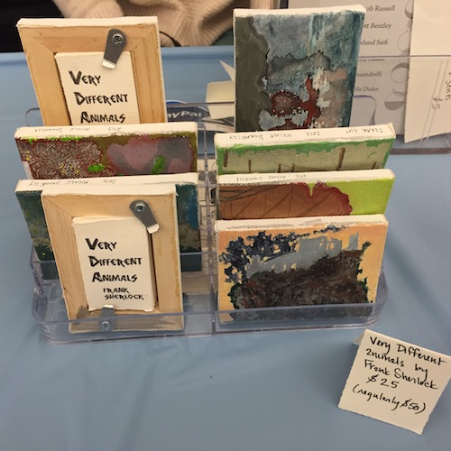
Very Different Animals is at first glance, well, a very different animal. On the one-hand, there’s a real emphasis on the gritty “one-off” nature of the tiny, stretched and stapled oil paintings that serve as the work’s covers, and the even smaller Frank Sherlock poem that is secreted away in the back of each painting, tightly folded into a rectangle like spy data and tucked behind a hatch.
Very Different Animals is a very different way of representing the relationship between painting and poetry than one typically sees. I wonder about the way it performs as both text and painting and the awkward, to me, way that it goes about doing so. Which is a good thing! But to you, how does Very Different Animals, for lack of a better term, operate? Is it hung onto the wall as a painting, with the poem acting as an unacknowledged thing secreted within it? Is the poem meant to serve as the soul or mojo within the painting? Was the poem written before the paintings or is it the the other way around? How do you think this dynamic affected the edition? All these questions, I really am so sorry about this…
No worries! It’s our hope that the books pave such great paths of inquiry like this. The design for Very Different Animals started with us poking around Dick Blick and being fascinated with these miniature canvases, especially the hollow behind them open like a mouth. Knowing we wanted to put a poem there, we received Frank Sherlock’s work soon after. This poem opens up so widely beyond the space of its constrained lines, using such vivid and unexpected imagery, that it seemed to be asking for some visual accompaniment. In fact, Frank's poems always seem to easily bleed into other arts. Perhaps this is also due to his successful, generous collaborations with other poets and artists—his work is in deep dialogue with the world. So Very Different Animals seemed to fit the the space of those canvasses, in both form and content. So we asked Frank if there was an artist with whom he wanted to collaborate, and he selected Philadelphia painter and paper-maker Nicole Donnelly. After reading Frank’s poem, Nicole chose to essentially dip each of the 100 canvases in a mixture of water and acrylic paint, allow the initial outline to emerge by chance, and then develop each painting from there. To us, the poem and the painting finish one another’s thoughts or say what the other cannot say due to the limits of their medium. Gratefully, because the reading experience belongs to the reader and not to us, we don’t have to decide whether this book gets hung on a wall or propped on a bookshelf, if the poem is a secret or a soul. Although, as a reader, I am attracted to the animistic element.
TOTEM
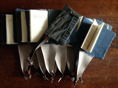
Brian Foley’s TOTEM is one of the more grammatically and syntactically experimental manuscripts we’ve published. One of its experiments renders isolated words and phrases into linguistic talismans. This almost sacred framing of language seemed a good fit for an update of the medieval girdle book form. The reclaimed denim cover tempers that with a bit of the everyday profane. Using as much fabric out of a single pair of jeans as possible while maintaining an appropriate level of uniformity over the edition is difficult yet pleasing. Some books are slim fit, some relaxed. There are a few that are downright baggy. My favorites feature knee holes, pockets and belt loops.
What I like about TOTEM is that, like the sense of Colorado you get from 100 Places…, here you get a really strong sense of Brian Foley himself. He’s a unique writer and person, with more than a little attractive chaos about him, yet he's also quick to smile, and is very much a warm, regular old good guy. I couldn’t help thinking that the use of denim, that most quotidian of fabrics, in a bizarre-but-accurate way—makes TOTEM into a sort of bizarrely accurate Brian Foley avatar or something.
We had never met Brian in person when we designed his book. We knew about his work with Brave Men Press and, of course, the chapbook. In revealing the form and materials to Brian for the first time, he was totally amused with how perfect the book captured him in it, too.
Additionally, in TOTEM, the text is still arranged in text-block-plus-cover form. It’s challenging sometimes to sequence the book as the author intended and not completely deviate from this structure.
In fact, the experimental accordion-style structure of One Hundred Colorado Places provides the reader autonomy to construct his or her own reading experience—the intended sequence devised by Robinson and Anderson is not immediately evident. Because of this, we also made a movie, posted on our website, that demonstrates how to read the text as they arranged it for any reader who chooses to do so.
Essentially, if we cannot perform a manuscript perfectly, we try to identify the primary themes of each text and unify these. It’s a balance between loyalty to the fidelity of the text and loyalty to the freedom of the reader’s experience.
Brandon Downing is a poet, visual artist, and filmmaker. His books of poetry include The Shirt Weapon...
Read Full Biography

